Case study
MET Airport
An airport website people come back to because they trust it.
Airports are built around movement: arrivals, departures, goodbyes. For most travellers, that movement starts with stress, long before they reach the terminal. And when they need information, they rarely go to the airport’s website. They go straight to their airline, because airport sites are usually too complicated to bother with.
Stress is the invisible passenger.
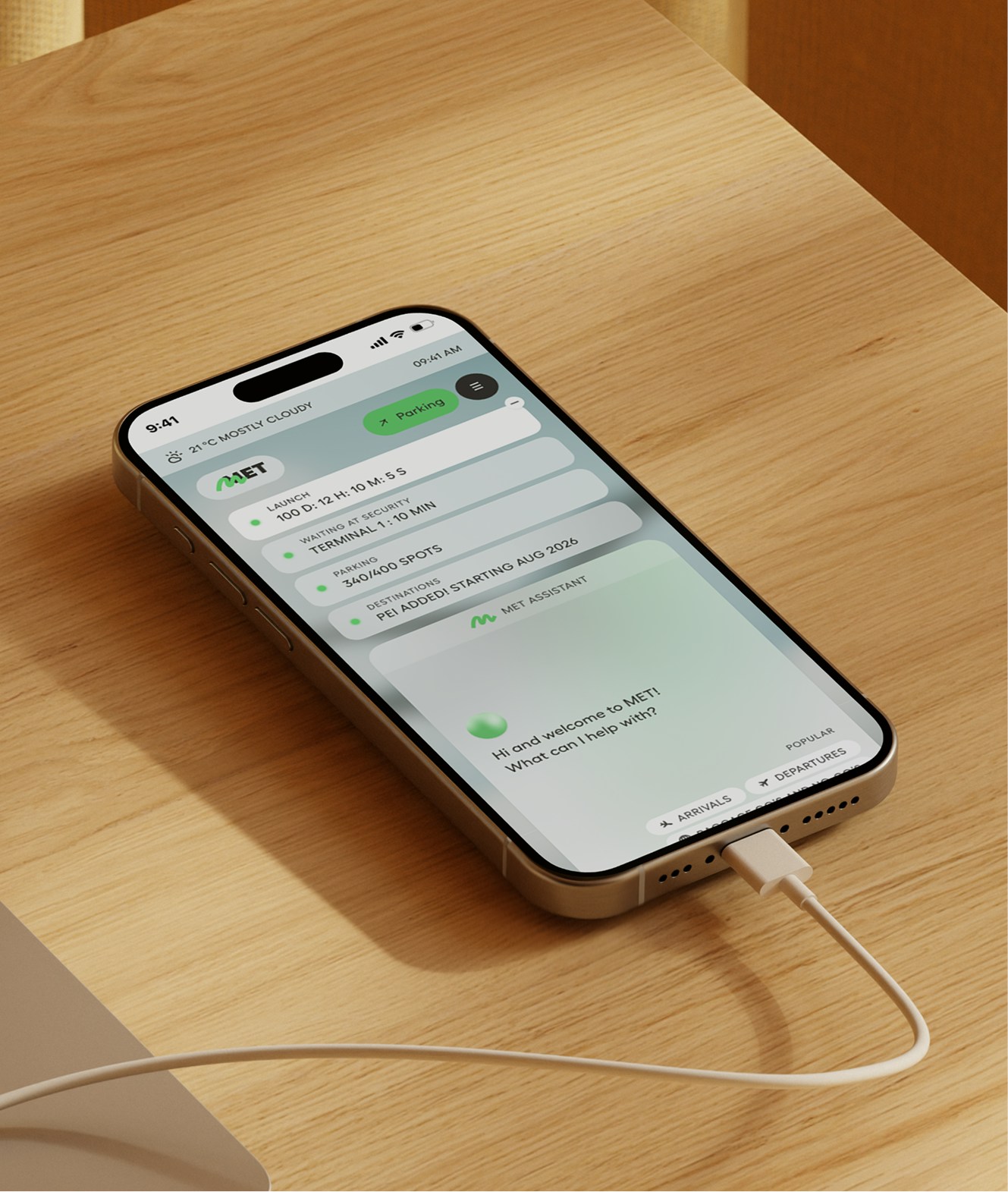
MET wanted a website no other airport has. Not just a functional tool, but a branded experience that still works perfectly when you need it to. The goal was to make the site a calm companion that simplifies travel and builds trust before passengers even arrive.
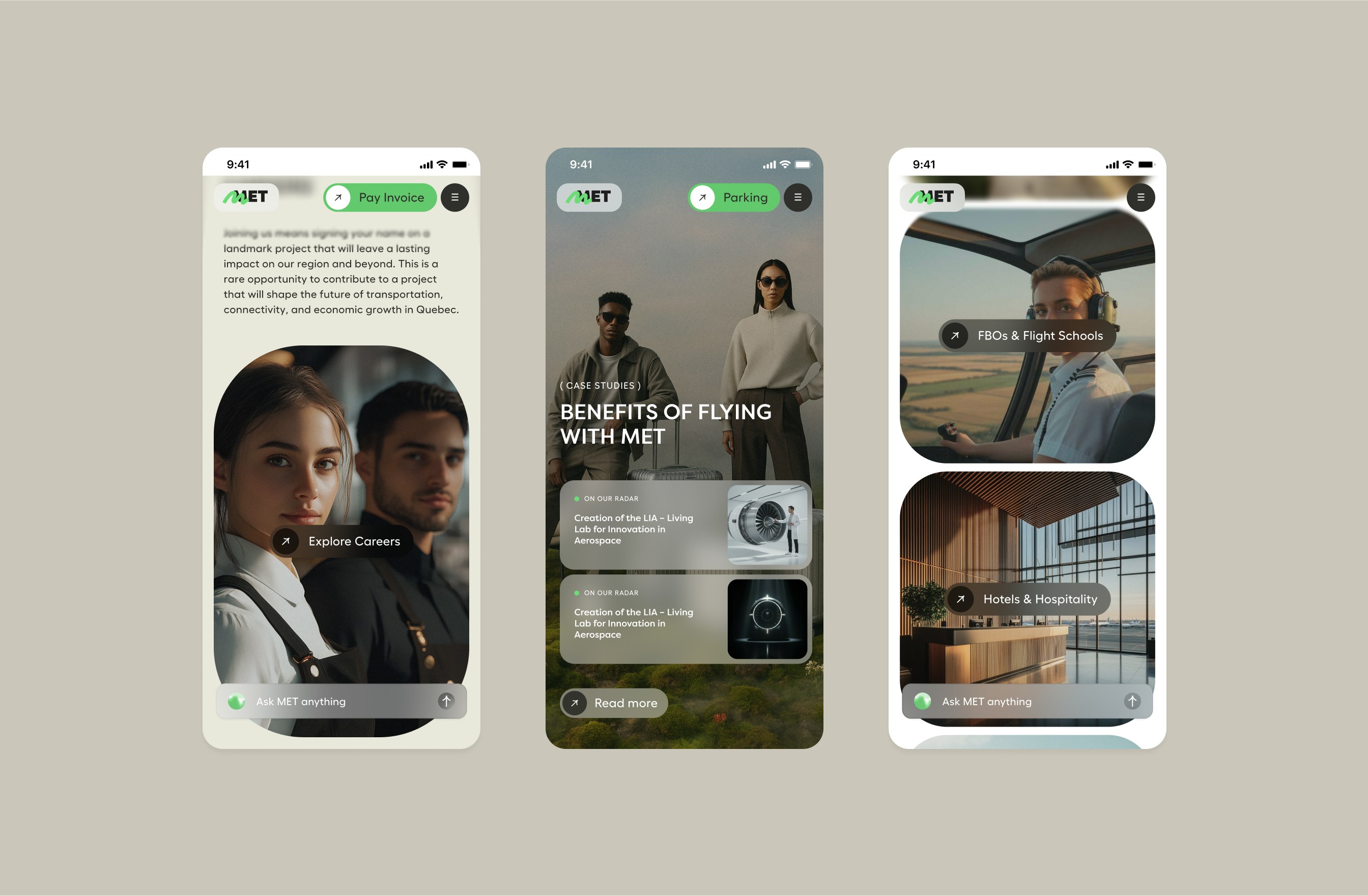
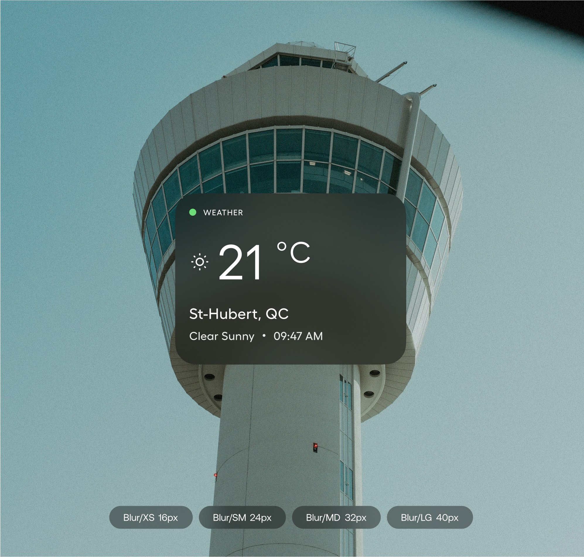
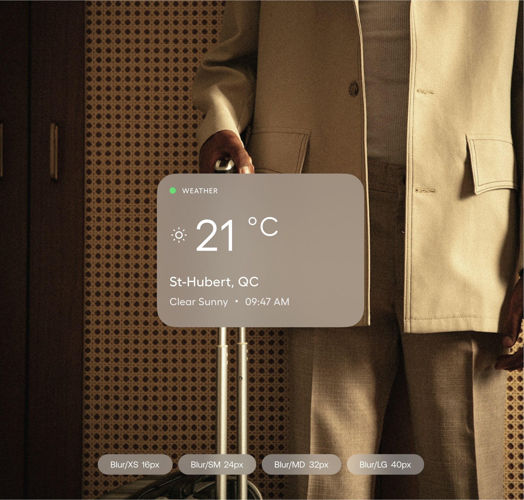
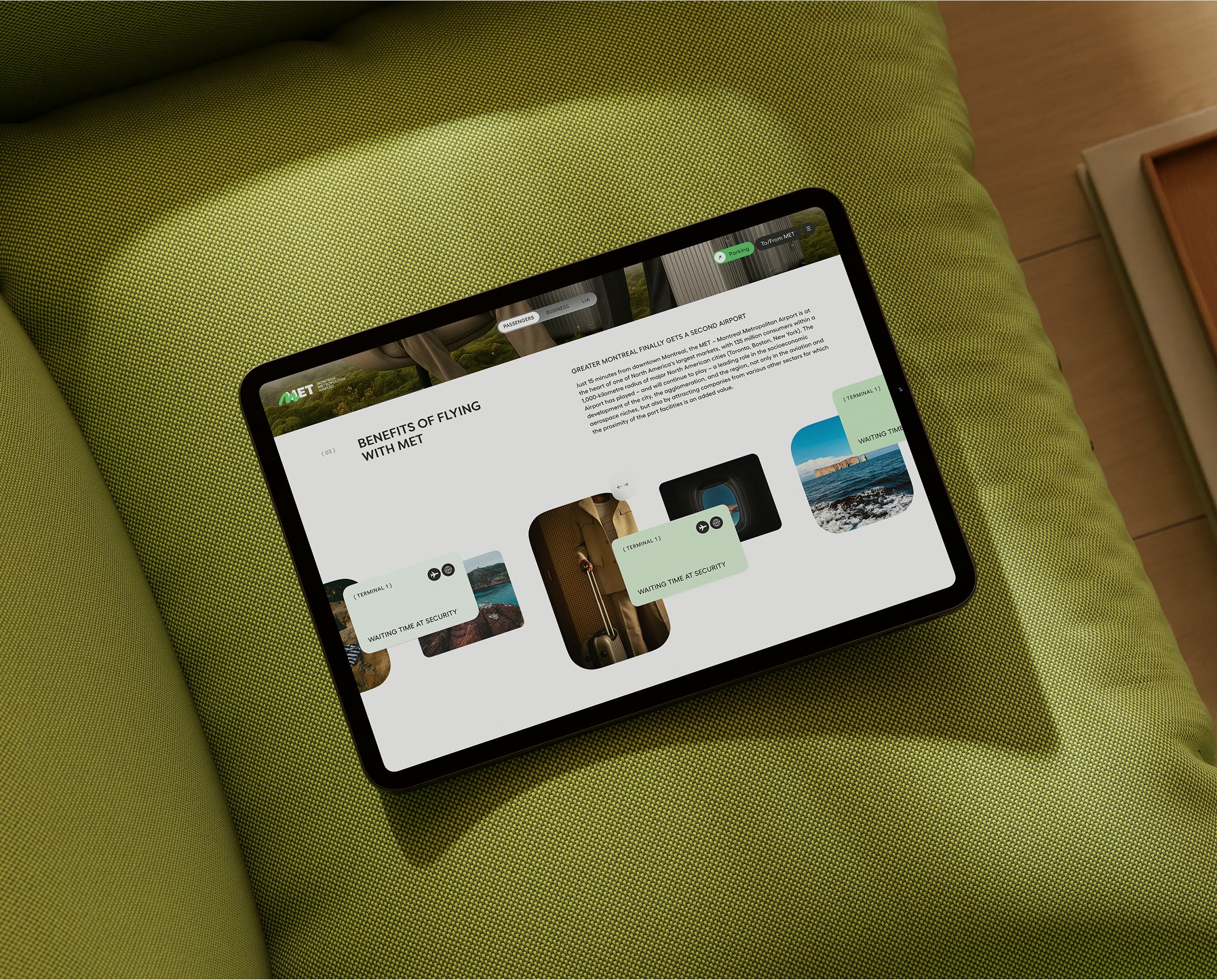
I designed most of the site’s pages, working from one rule: every screen has to lower cognitive load before it adds anything else. The structure was stripped back so travellers find what they came for quickly, and the brand carries the experience without getting in the way. The visual language is built around three ideas from MET’s positioning: mobility, innovation and organisation. Calm layouts, clear hierarchy, and motion used to guide rather than impress.
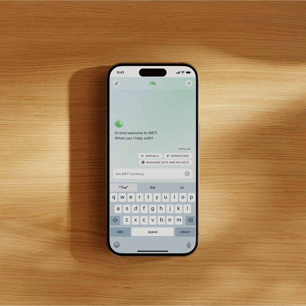
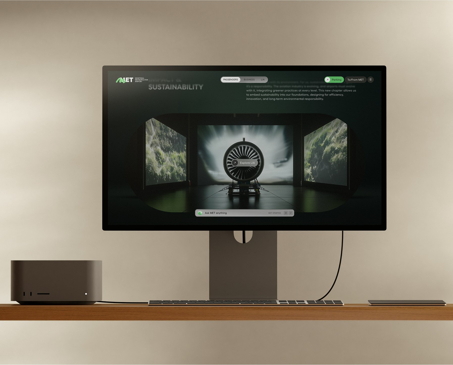
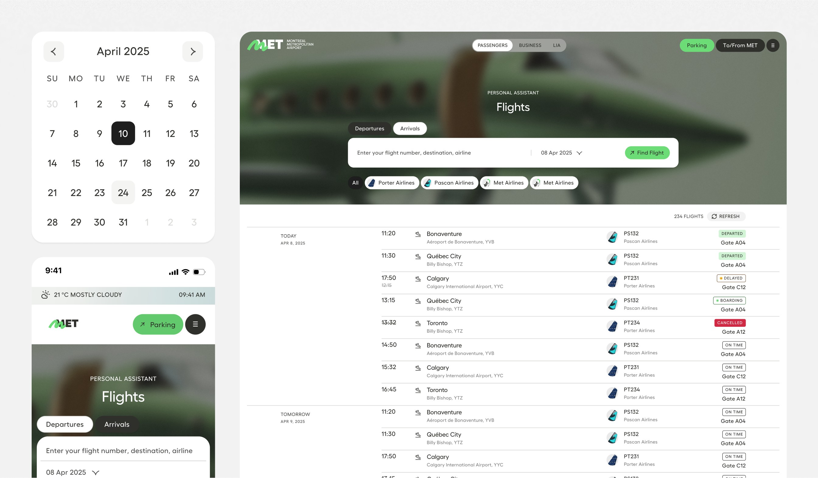
Alongside the site, we designed an AI assistant travellers can ask about anything: their flight status, getting to the airport, services in the terminal. Instead of digging through menus, people ask in their own words and get a direct answer.
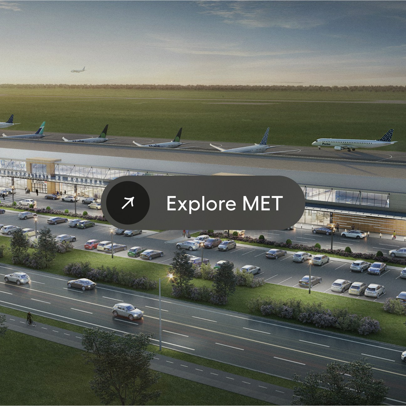
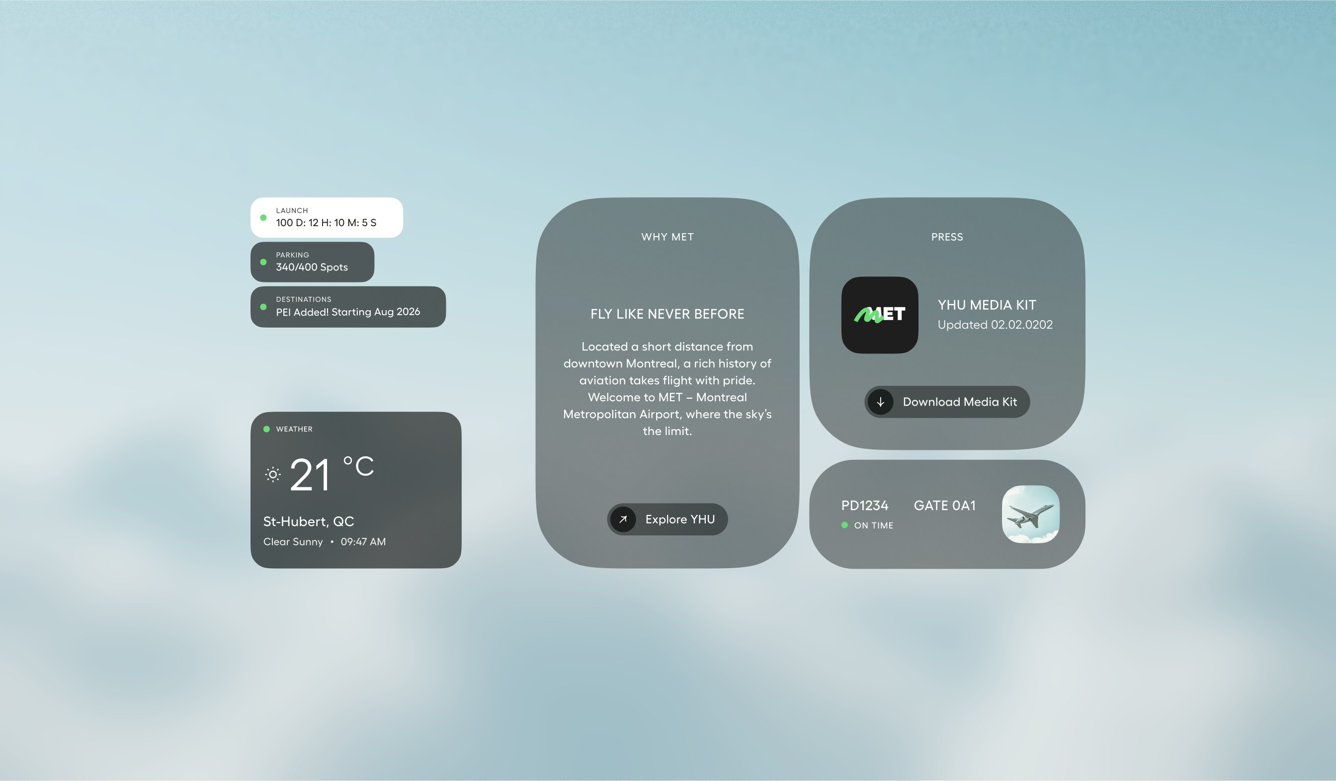
Travellers now come back to MET’s website out of trust, not obligation. The assistant has become a daily concierge, and the site does what an airport website rarely does: it makes the trip feel calmer before it starts.
Results
2.6 s
Response time
Median time for the AI assistant to answer a question.
1,456
Daily questions
Questions asked to the assistant per day, on average.